
Branding design

Zenrí is a conceptual eco-conscious corporation dedicated to helping businesses embrace sustainable practices and reduce their impact on the environment. Its mission is to foster a more sustainable future by empowering organizations to take meaningful action toward environmental responsibility.
As my first comprehensive branding project, Zenrí challenged me to develop more than a logo - I created a cohesive visual identity, brand voice, and vision for an imagined company from the ground up. The project includes a full set of brand guidelines, as well as the identity for Zenrí’s subsidiary, Dr. Zippy Auto Spa & Care Center, demonstrating how the brand could extend across distinct applications while maintaining a unified visual language.
the brand
In developing Zenrí as a whole, I began with establishing its core values. From there, I centered its design around them, amounting to a brand with a calm, clean, modern feel, and a gentle yet punchy voice.

type exploration
I experimented with a variety of different typefaces, and drew inspiration from the strongest iterations to combine into one unique expression.


the logo
The next step in completing the logo was creating a memorable, appropriate icon that showcases Zenrí's mission and values. I opted for a symbol that represented unity and environmental harmony, emphasizing the importance of togetherness in sustainability.

A vibrant, high contrast blue and green were chosen to give a high-energy, future-forward feel to the brand. Beyond aesthetics, however, these two colors hold true meaning - the blue and green can literally represent water and earth, but their applied meanings of hope, connection, life, and investment make them the most effective color expressions for Zenrí's brand.

Century Gothic Pro is the hero type of Zenrí, balanced by the more subdued Ballinger, and the formal, grounded Georgia. These typefaces work together to bring classic to the contemporary, promoting familiarity and trust.

Each color, representing a different piece of the Zenrí identity, comes together to offer a bright, vibrant voice, which exemplifies the optimism of the brand.
logo variations & initiatives
Zenrí is imagined as a future-forward, community-oriented brand that assists subsidiary companies in achieving consistent, sustainable practices while also offering assistance to communities in need.


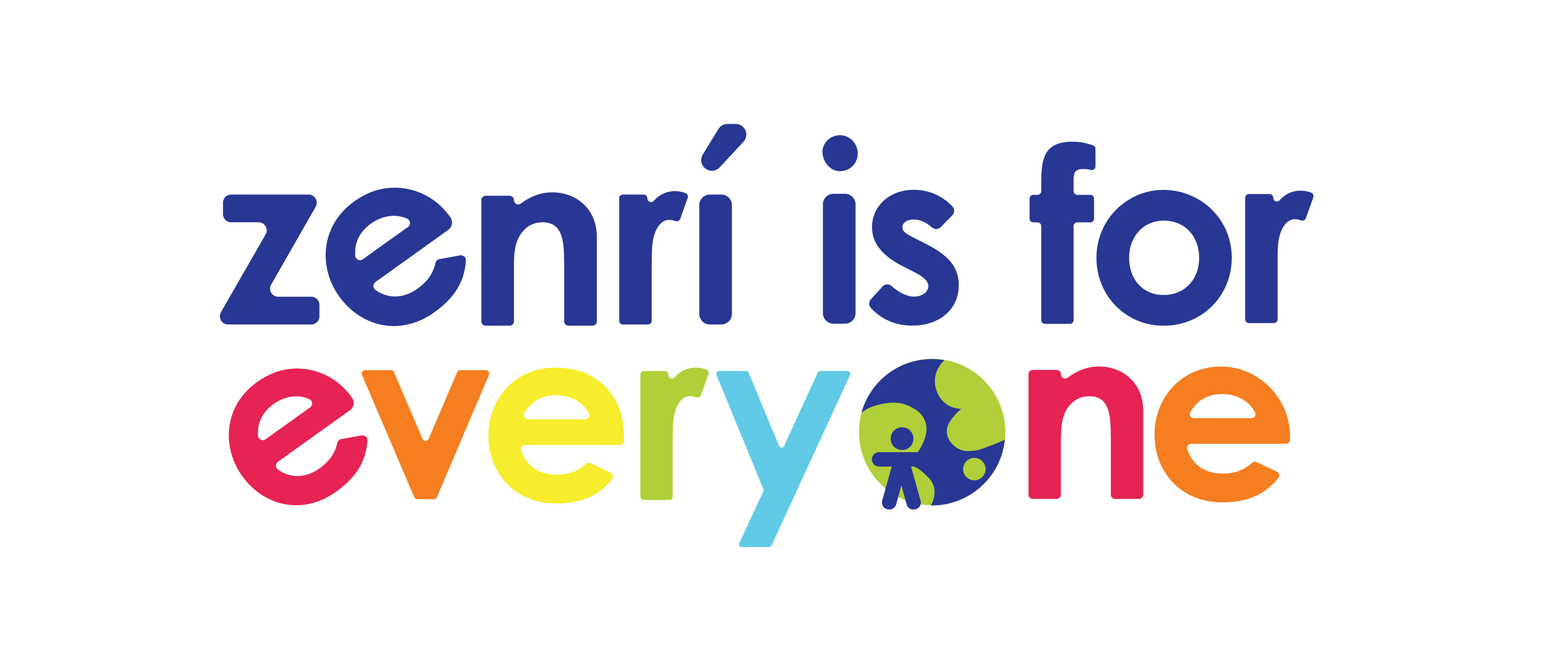
"The Everyone Initiative" imagines a community-oriented campaign held by Zenrí. The concept came to me when I felt a need to show how I imagine Zenrí would give back to its community, taking into consideration its core values and the needs of the modern day.

zenrí in the real world
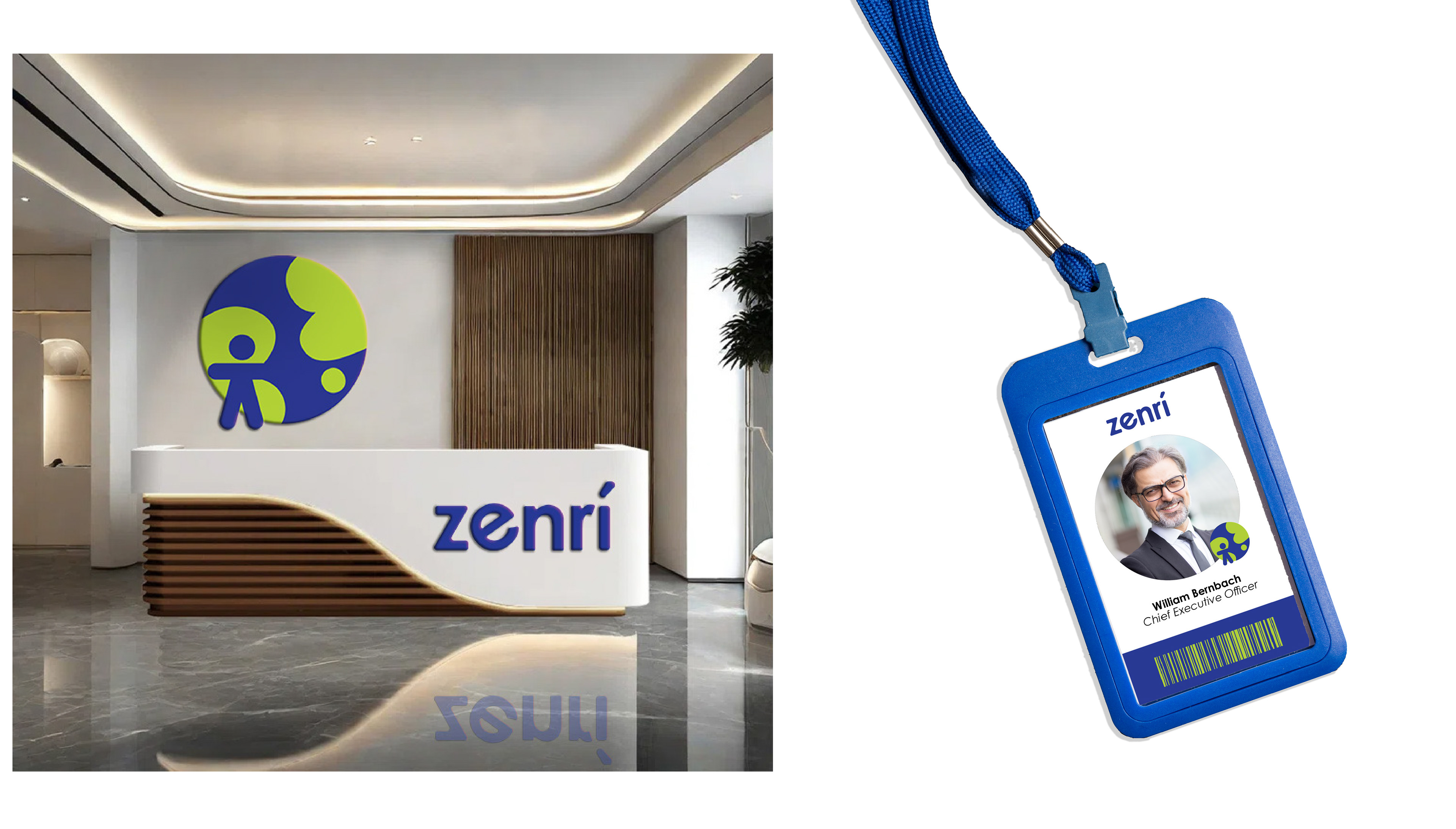
Here, Zenrí's visual identity is extended into a cohesive collection of tactile, everyday touchpoints. Each piece balances the brand’s refined, contemporary aesthetic with thoughtful details that create a warm and memorable experience across print and physical applications.



the subsidiary: dr zippy
After defining the parent corporation of Zenrí, I asked myself, what kind of company would it collaborate with? How would it enact its goals as a company?
I was tasked with the subsidiary of Dr Zippy Auto Spa & Care Center, which presented a unique challenge - framing an auto care center in a sustainable context. My main goal with Dr Zippy was to design a brand that could complement Zenrí in both visuals and practices, leaving the impression of a future-forward, eco-conscious service.

bringing dr. zippy to life
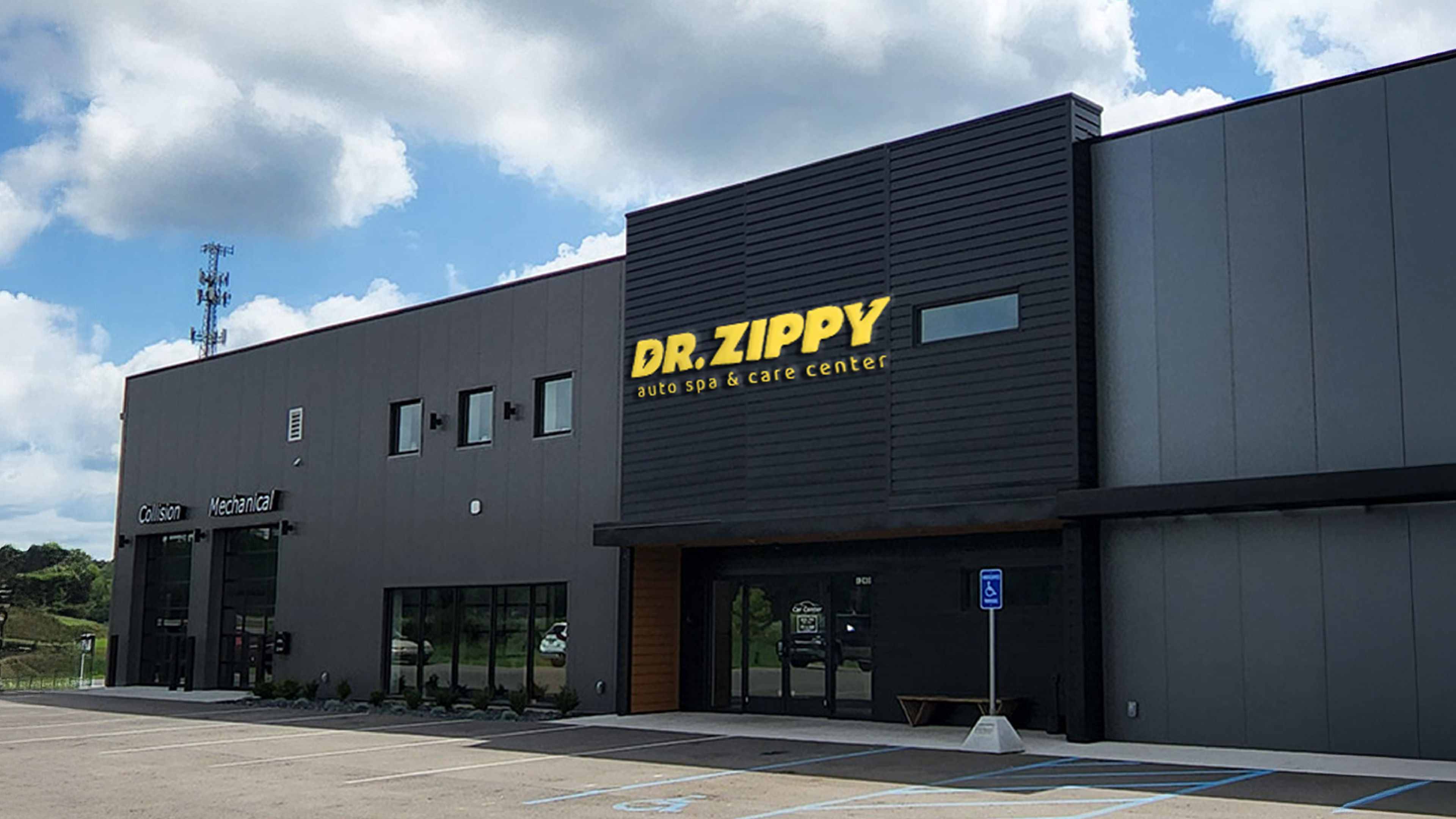
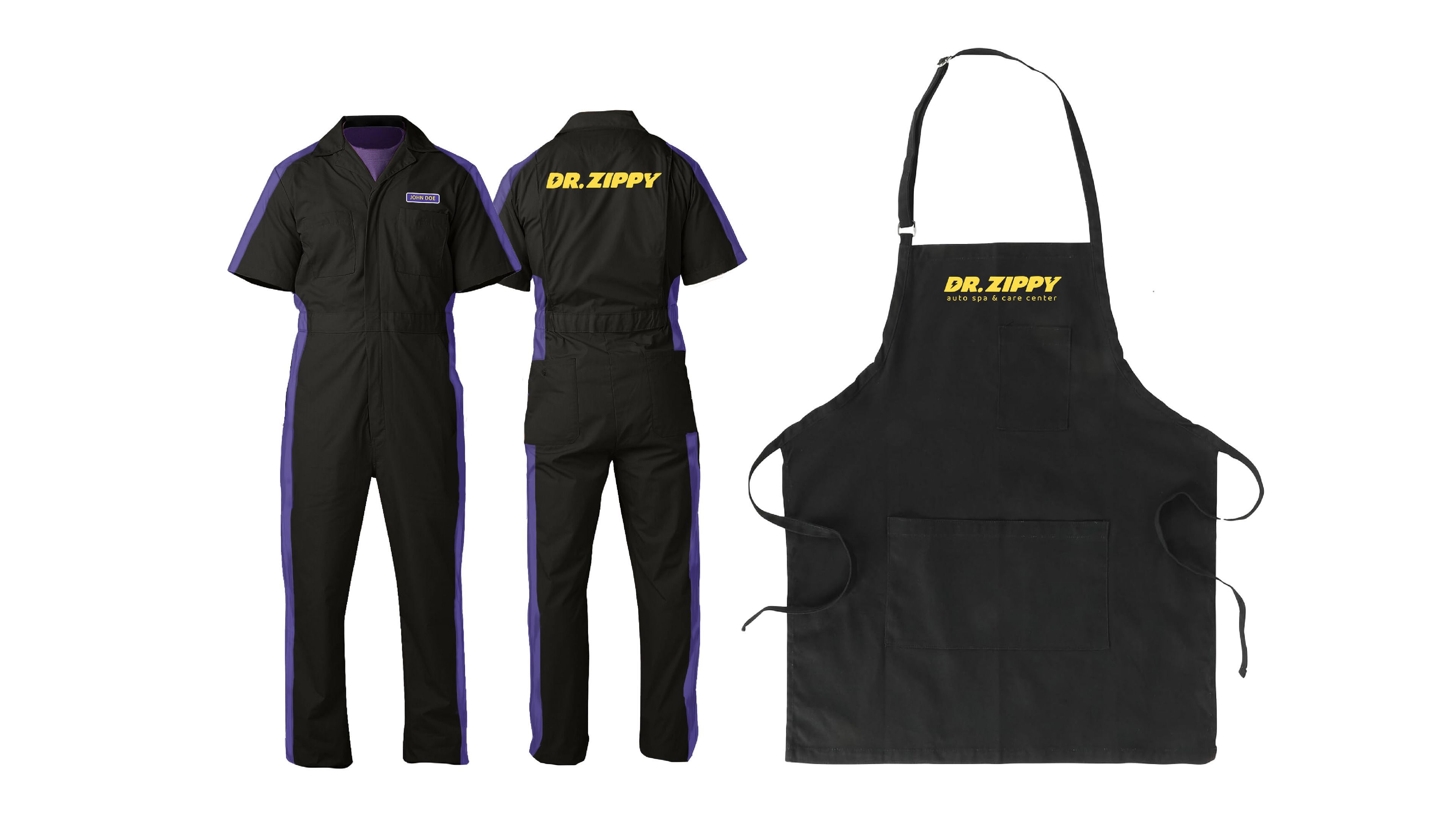
Dr. Zippy's visual expression is brought to life through multiple touchpoints: physical location, company vehicles, uniforms, signage, and printables.




Credits
Design - Fiona Dale


