
Branding, packaging, web, apparel, & gallery design, photography

Pink Moon is a brand built around the moments between destinations. It reimagines the American diner as a place of pause and belonging, removed from its familiar context and placed into something new and refreshing.
Rather than relying on labels or nostalgia, the brand uses implication to shape experience - letting atmosphere, timing, and tone lead. The result is not a replica of a diner, but a re-envisioned one: a space designed to hold presence, not urgency.

Retro futurism serves as a response to 24-hour culture and the burnout embedded in contemporary life. It draws from a time when the future was imagined as communal, optimistic, and humane - before constant availability became an expectation. Familiar diner forms - chrome, neon, rounded typography, saturated color - are reframed in a slower, more intentional environment. This is a diner outside linear time, where lingering is allowed, rest is respected, and the future feels gentler than the present.
defining the core identity
The Pink Moon brand was built around the whimsy of nostalgia, pairing the familiar charm of a classic American diner with a more playful, future-forward sensibility. Through exploring the logo, color palette, and typography, I developed a visual language that feels nostalgic without becoming overly retro - balancing warmth and familiarity with a sense of optimism and possibility.

To consider what visual direction to pursue, I thought of what values best represent Pink Moon as a brand, and its mission. Pause, belonging, and care are these core tenets, which led me to explore softness and comfort in design expression.

Typography was central to establishing Pink Moon’s personality, balancing the familiarity of a classic diner sign with something more playful and contemporary. Gradients and glowing treatments helped push the nostalgic concept into a more future-forward direction.
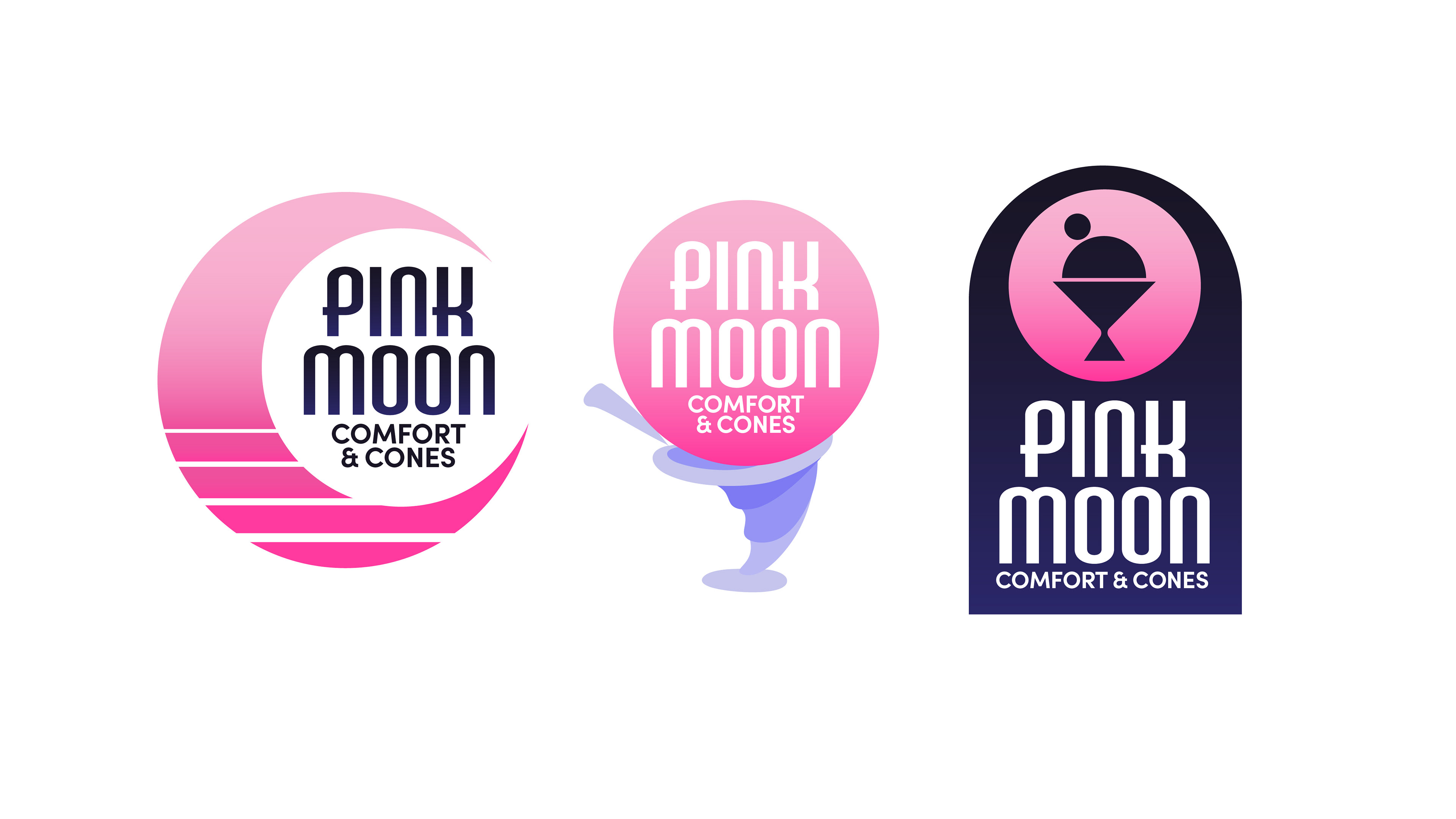
In later iterations, prioritizing readable text and a recognizable expression, I revised the name to “Comfort & Cones” and introduced a silhouette against the moon, creating a more distinctive mark.


pink moon in color
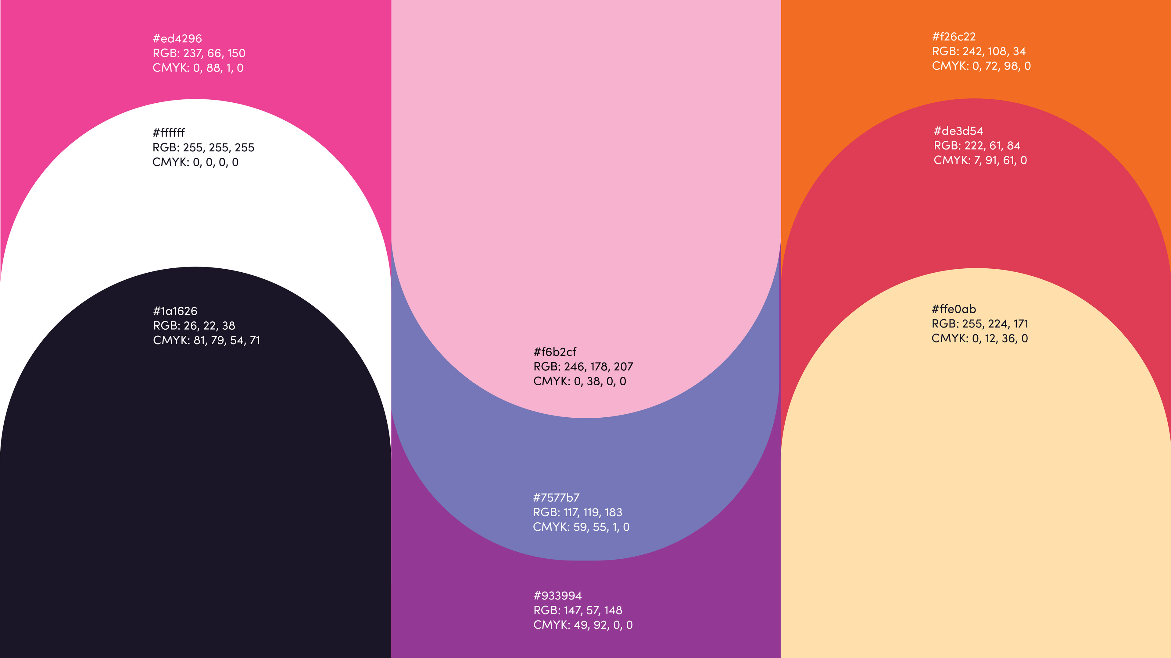
Pink Moon is defined through primary, secondary, and tertiary color palettes. Each color acts as more than an aesthetic choice, but a representation of Pink Moon's values and intention. Cool and warm balance each other to disallow too icy of an impression, while keeping a mystical whimsy to the brand's feel.
type as a system
The typography balances personality with practicality, carrying inspiration from classic type associated with diner signs and theater advertisements, while keeping it feeling modern through the complimentary soft, rounded type in contemporary typefaces.

AM Udine brings a campy, retro energy to display type, All Round Gothic adds a soft and playful complement, and Sofia Pro grounds the system with a clean, approachable foundation.

the menu
"New American Comfort Food"
making the menu
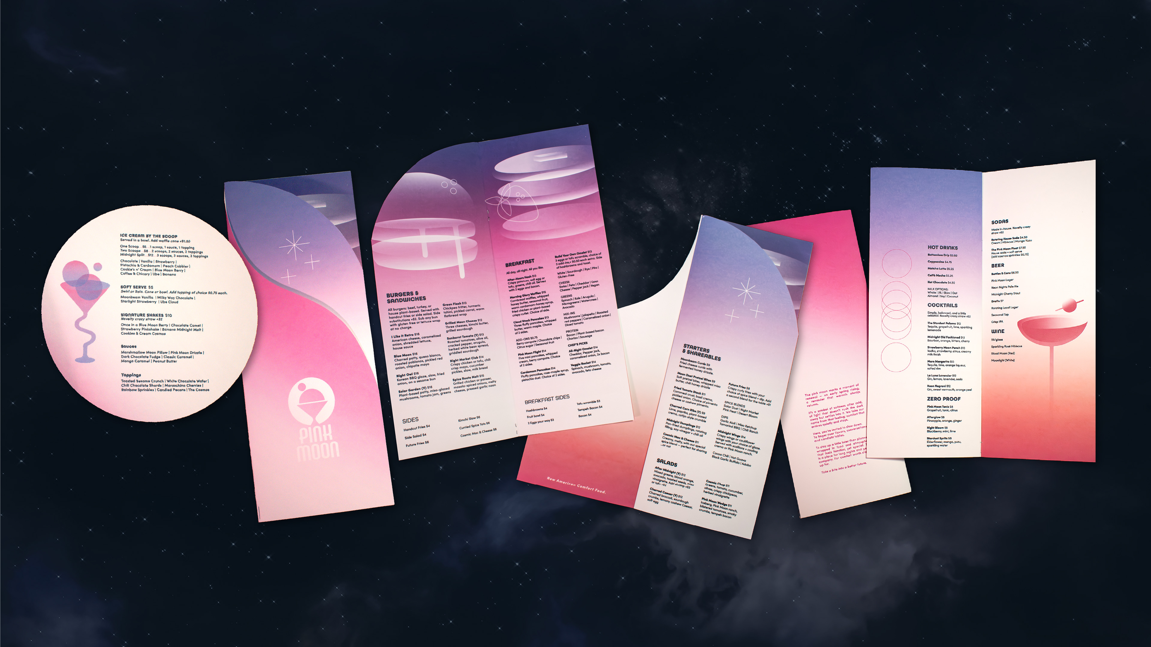
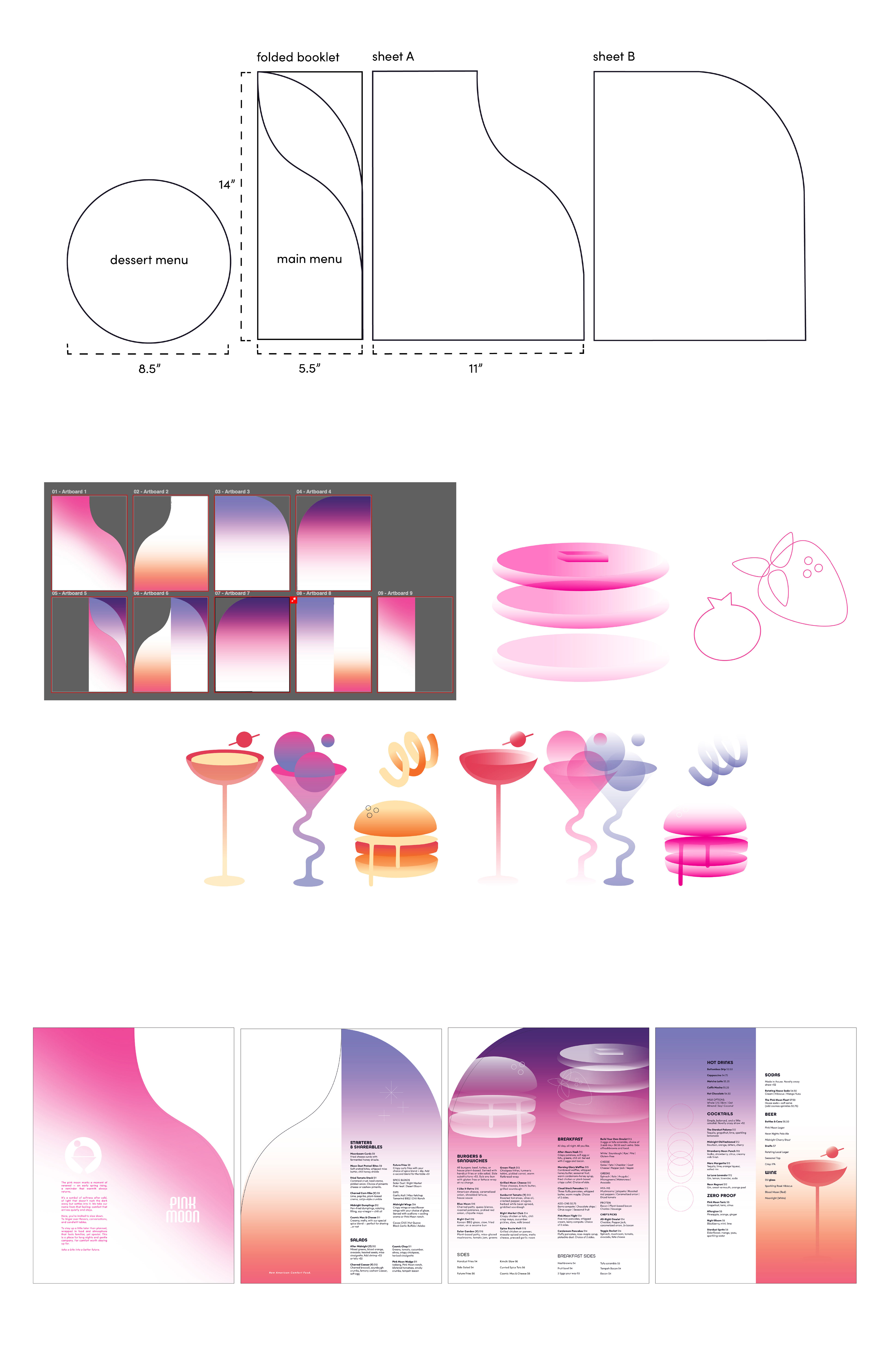
The menu for Pink Moon demanded something unique and memorable - an object that mimicked an artifact of the future, while holding onto enough familiarity to lean on a warm, nostalgic feel. This is reflected in its physical design, and contents.
When considering the form the menu would take, I had to ask myself what experience Pink Moon wanted to offer its customers. Pink Moon ask you to slow down, to take things one at a time, to linger.
The dessert menu was separated from the main, and made to be a single, circular sheet that could be set waiting for a customer at the bar. This invited dessert to not just complement the main offerings, but be its own standalone experience. The main booklet is familiar, but special. It is a simple booklet format, but is given an elongated shape, vibrant color gradients, and smooth wave cuts revealing pages underneath. This allows gradients to layer, each page working in conversation with the other.
defining imagery
Food Photography & 3D Rendering

The imagery used in Pink Moon's advertisements needed to balance the surreal with an appetizing look. To achieve this, I knew I wanted to create my own unique imagery. I decided to experiment with both food photography and 3D rendering, exploring their respective strengths in what kinds of images can be made with each tool.
For the subject matter, I decided to focus on the basics of Pink Moon's menu: burgers and ice cream.
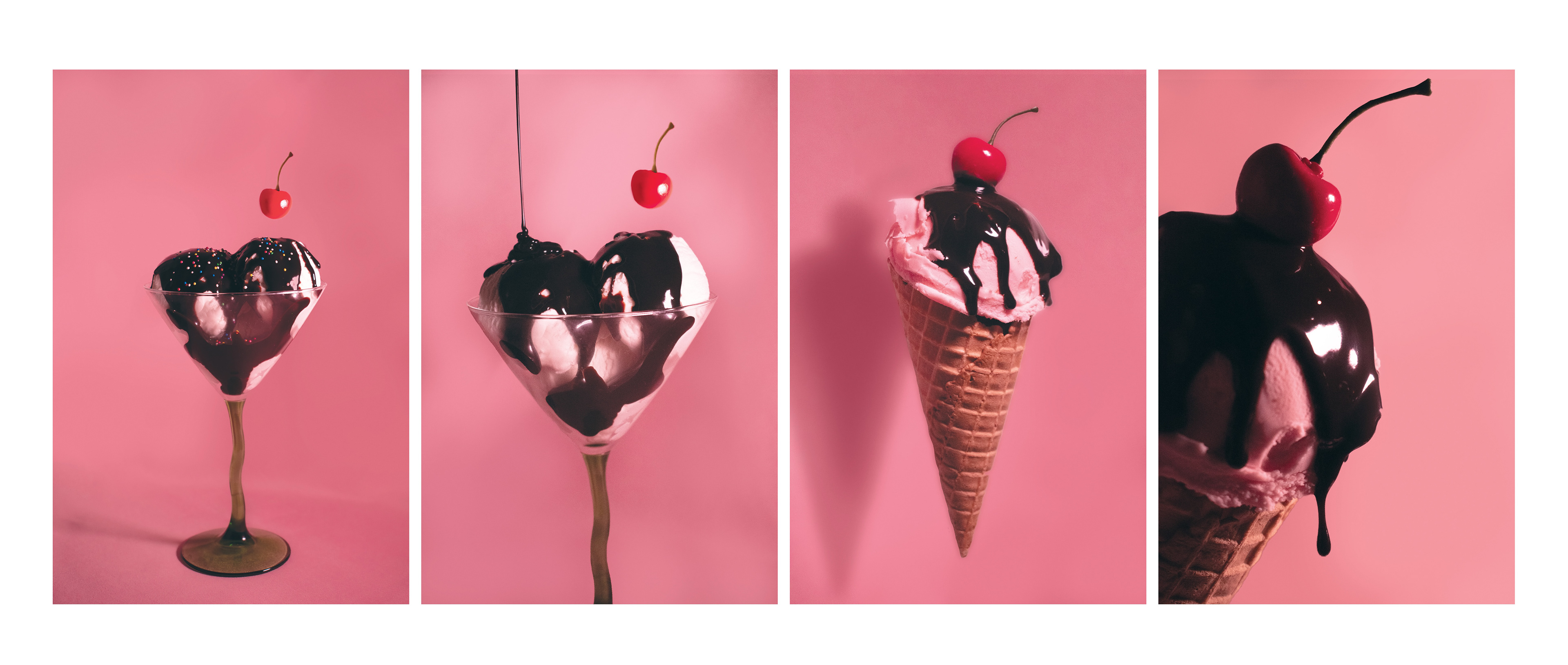
The photography process included making fake ice cream, curating props, and creating a studio space to execute the photoshoot. Much of this process can be found in my Process Book (linked at the top of this page). Photographing physical objects allowed for great experimentation and variation, and strong control over small details such as the color of the ice cream, the toppings, and the containers. Above are the refined and edited top four out of the 340 images taken. The third image is what I settled with for the final poster design, as it captured the right amount of whimsy and delectability while also maintaining strong recognizability within a viewer.
What I wanted out of the burger imagery was something exceptionally surreal, which a 3D model was best suited for. The program I used is Blender, where I posted the model and added appropriate lighting to best fit the specific outer space background I intended to utilize.

merchandise
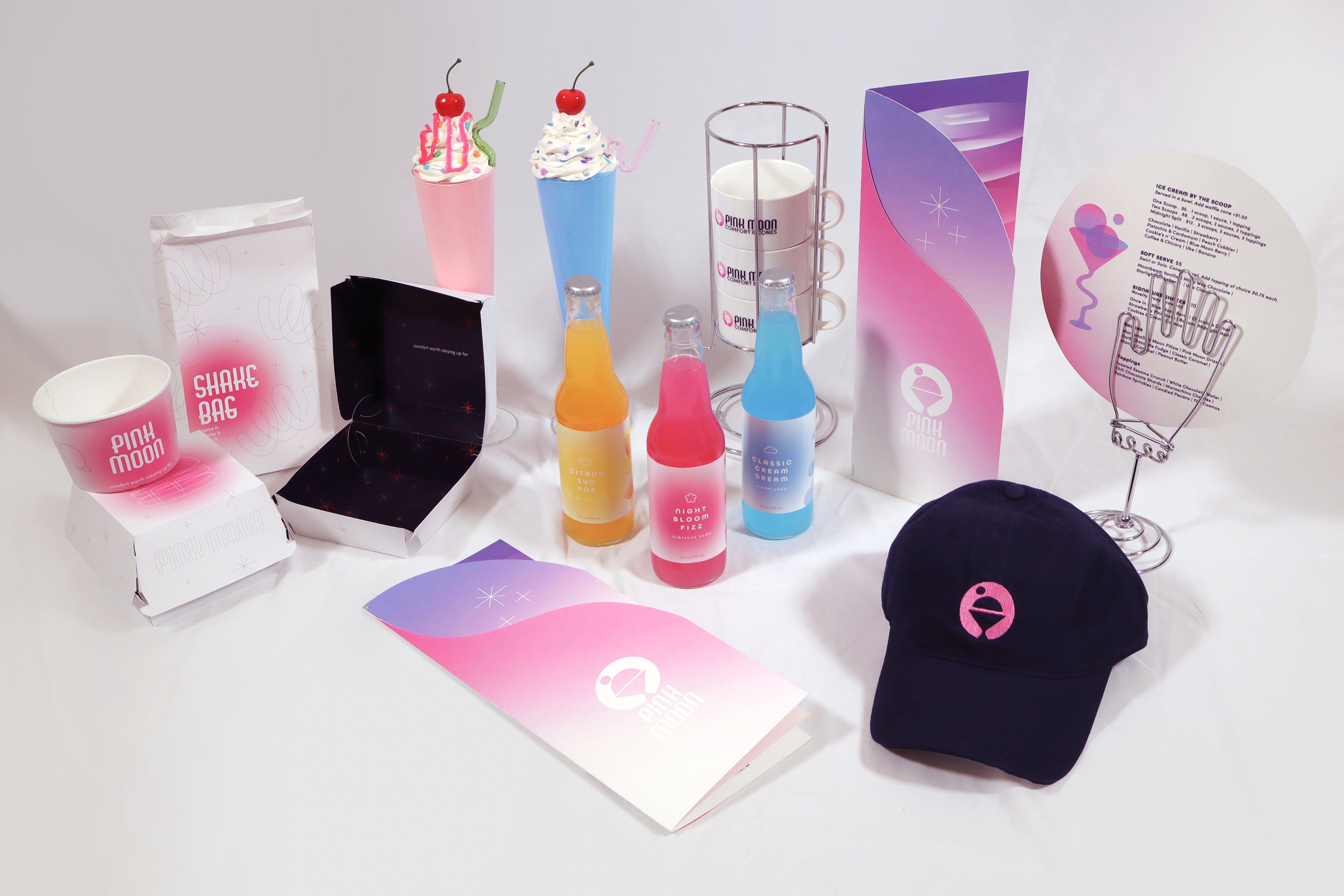
Extending the Pink Moon experience beyond the diner, the merchandise brings the brand into everyday life through playful, tactile pieces - from artisanal soda to wearable graphics designed to feel like souvenirs from a favorite late-night spot.


Cosmic Pop is Pink Moon's own artisanal soda pack, including Night Bloom Fizz (hibiscus), Citrus Sun Pop (mango yuzu), and Classic Cream Dream (cream soda).
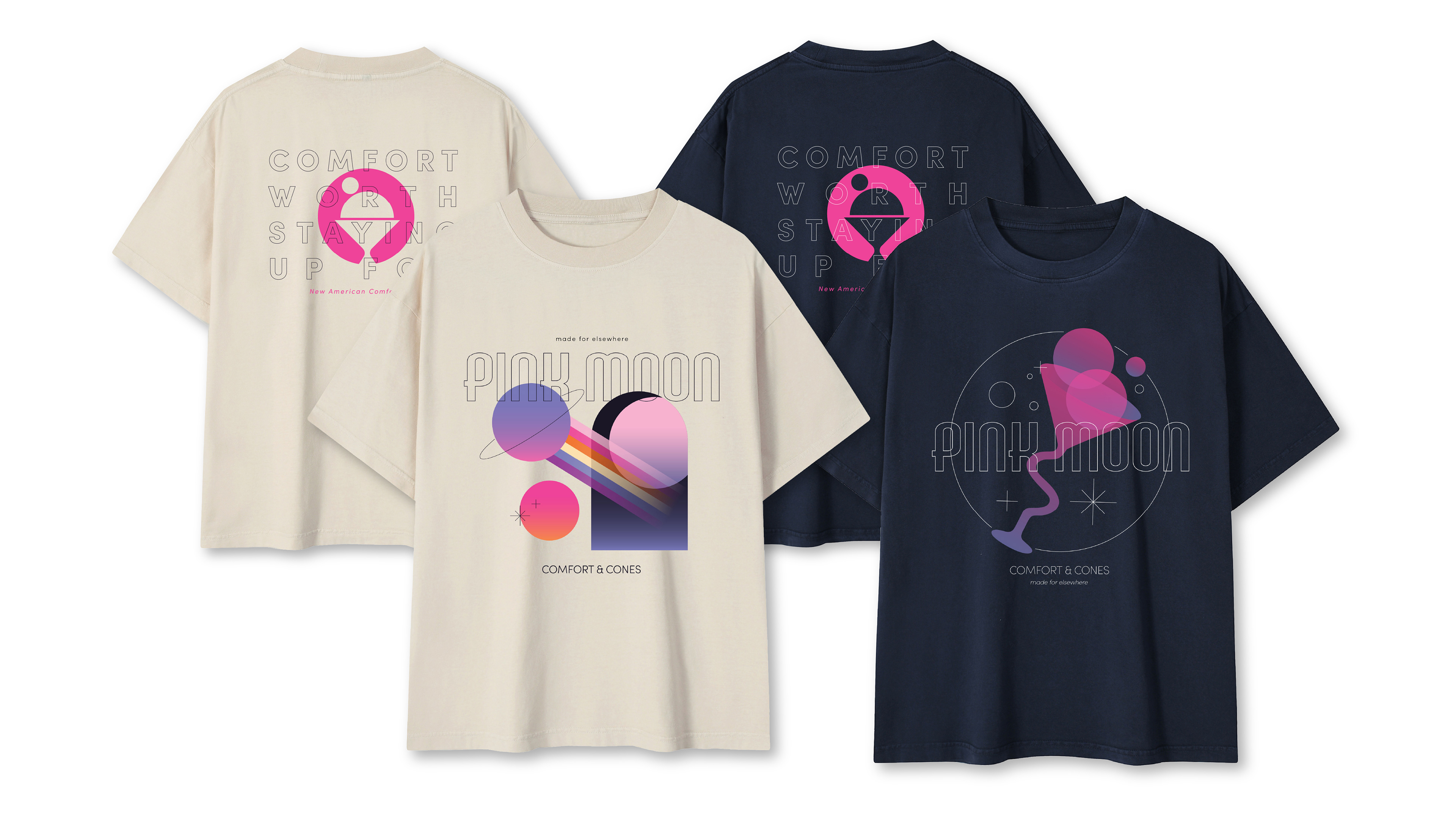
Shirts, front and back, in navy and soft cream. Featuring Pink Moon's signature catchphrases, including "comfort worth staying up for" and "made for elsewhere."

Stacking mugs, with the Pink Moon logo on one side, and a rainbow on the other that aligns with the other mugs when placed in a stack.
on the web
For Pink Moon's Website, I wanted to emulate the look of a sort of "space hub" - something that works as more than just a website, but as an extension of the Pink Moon world.

the prototype
in the gallery
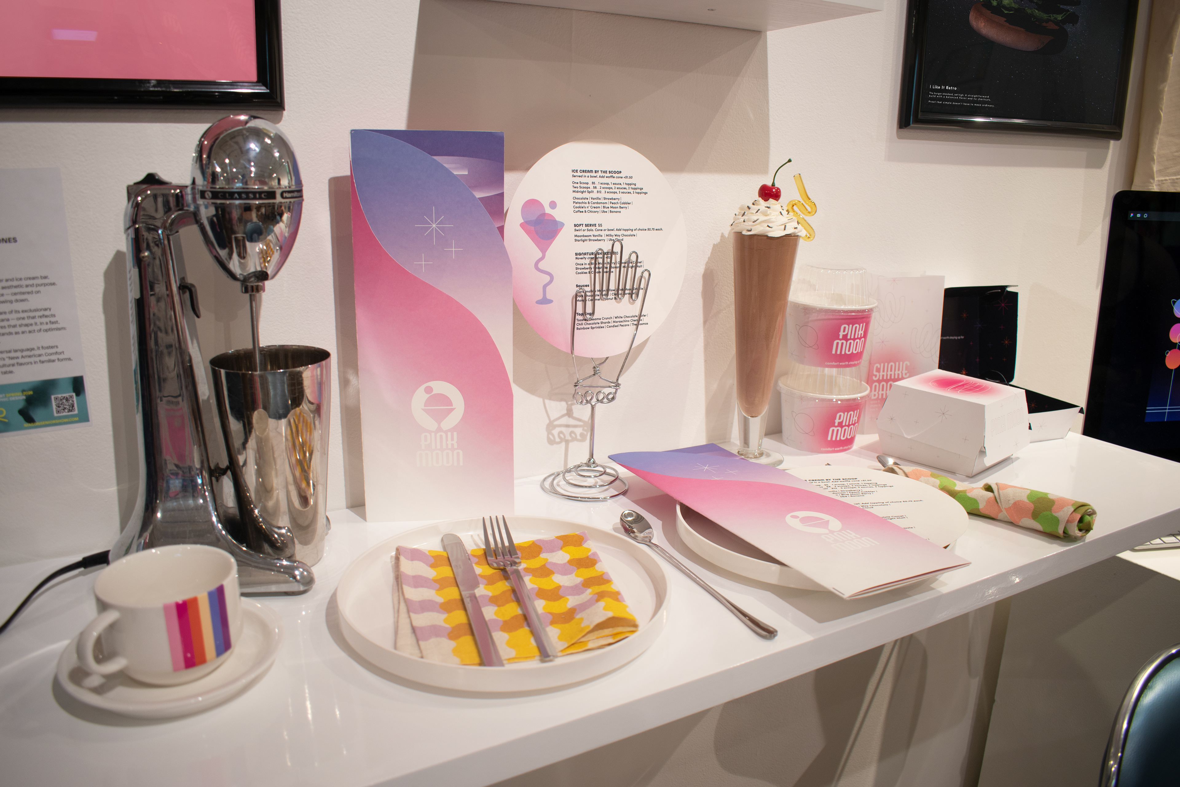
From the beginning, Pink Moon was considered from an experiential context. I wanted to exemplify this in the gallery design, having the diner itself almost pop out at its viewer. To accomplish this, I mounted a floating bar setting with handmade props and curated retro decor pieces.
Much of this process was logistical - finding manufacturers, handling different printing processes for menus, posters, and packaging, and acquiring / making props. One of the prop highlights for me has to be the milkshakes made out of thrifted glasses and lightweight spackle, topped with crazy straws.
Every detail was highly considered, from the takeout packaging holding fake hamburgers, to the custom printed napkins and vintage coupe plates. The gallery space was an outlet for me to design a unique and memorable experience, in addition to the special, playful brand that is Pink Moon.


Credits
Design - Fiona Dale
Project Photography - Fiona Dale


