
Editorial design

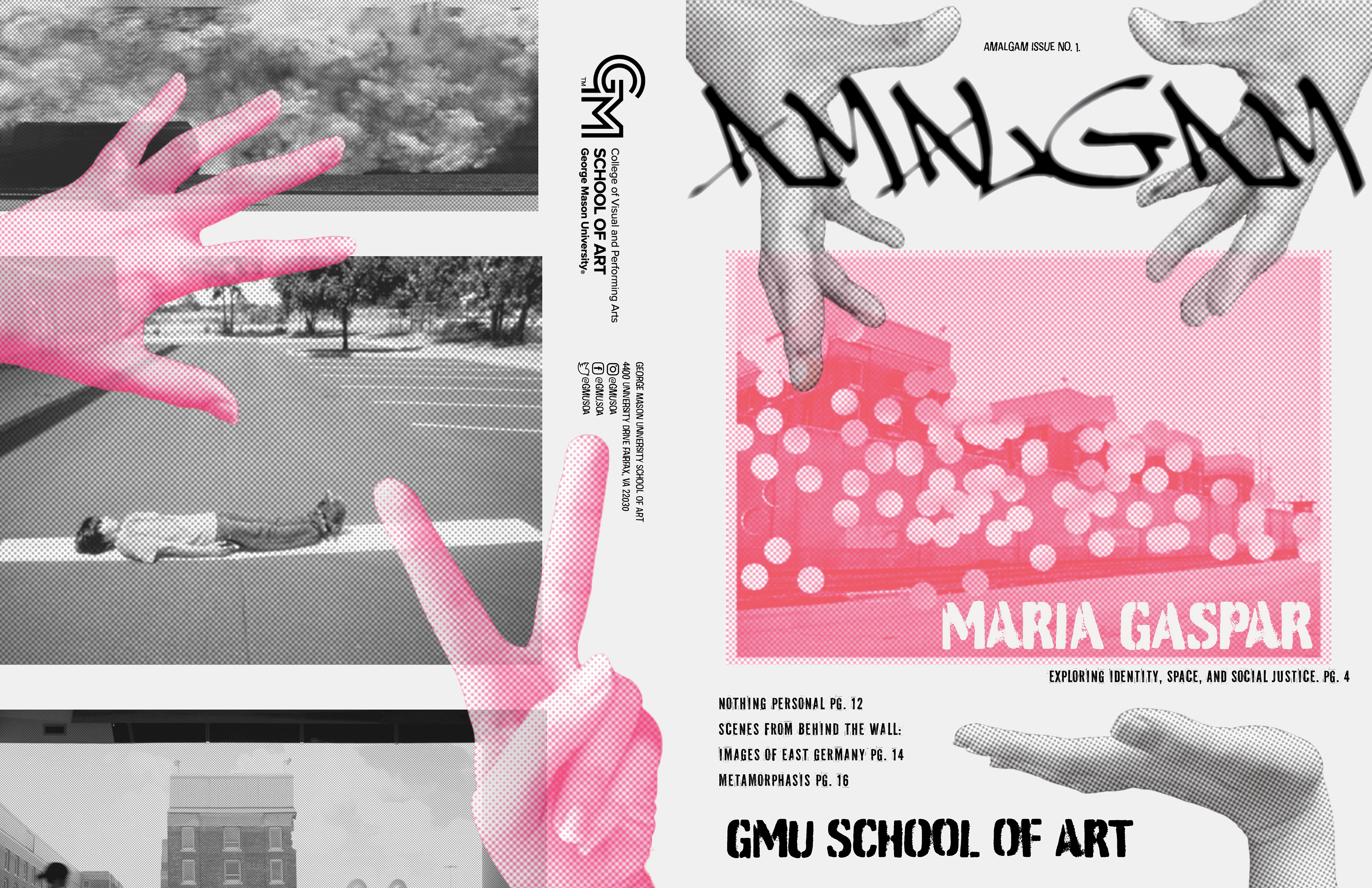
Amalgam is a concept for a school of art publication exploring the intersection of art, design, and culture. The publication pairs bold, experimental spread layouts with graphics inspired by the layered textures and imperfect registration of risograph printing and letterpress.

the why of amalgam
Amalgam is a publication that imagines a connected creative community, with an opportunity for students to engage with voices they may not otherwise encounter.

the grid system
A 6 column grid system was used for designing Amalgam, allowing for layouts to follow a full page, 2 column, and 3 column guide. Having a system with this flexibility allowed for the experimentation Amalgam called for, while keeping enough structure to have the design feel cohesive between each spread.

the type system
Amalgam's type system is made up of three major parts: Subway NewYork (a wild, street-art style typeface), PF Fuel (a grunge, structural, printed typeface), and PT Sans (a grounded, smooth body type).

creating imagery
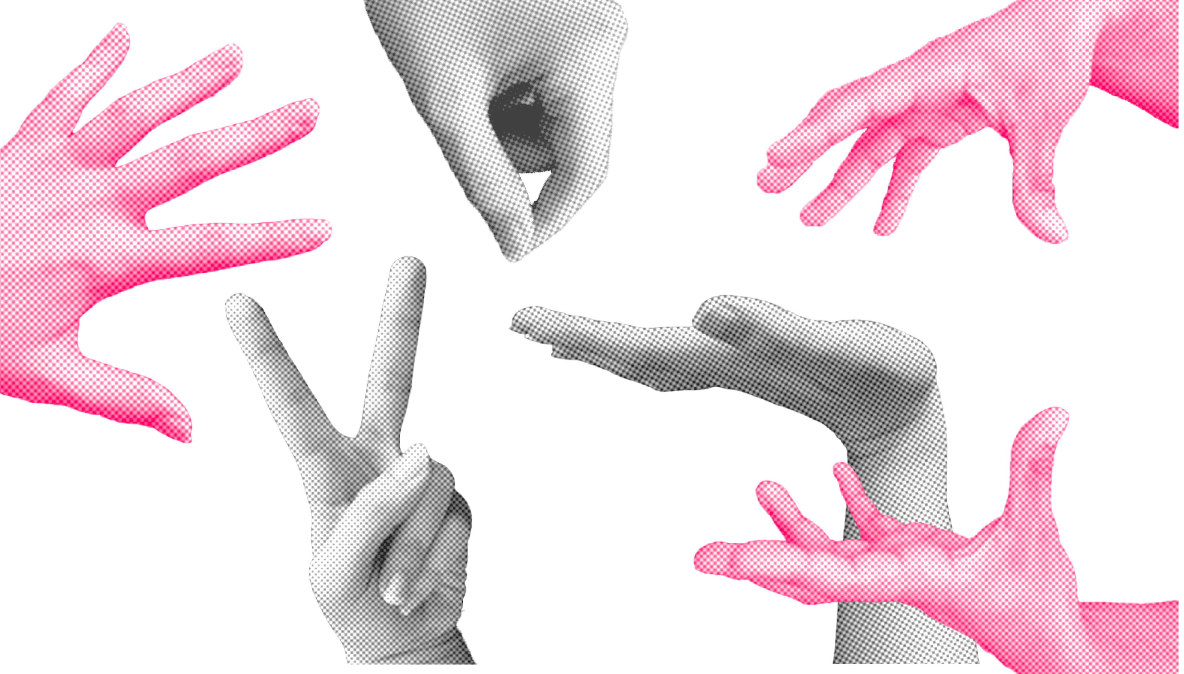
This project combines both collected imagery, and imagery created by myself. These hands play a part in the "assembly" of Amalgam, bringing different pieces together.
the spreads
Each spread in Amalgam is playful and unique, while still working in tandem to offer one voice.


Credits
Design - Fiona Dale
Magazine content - Mason Exhibitions & Maria Gaspar
Hand photography - Fiona Dale


