
Advertising, branding, & motion design

DC Downbeat is an advertising design project spanning both the physical and digital spheres. Imagined in collaboration with Destination DC and DC Metro, the organization brings an annual jazz crawl to the local community, connecting audiences with music and venues throughout the city. From its visual identity to its campaign materials, the project explores how design can build excitement around an event while creating an identity that can evolve year after year.

The concept behind DC Downbeat begins in the name. While the downbeat marks the start for each musical measure, DC Downbeat is the beginning of a new musical journey, offering a new way of experiencing the nation's capital.
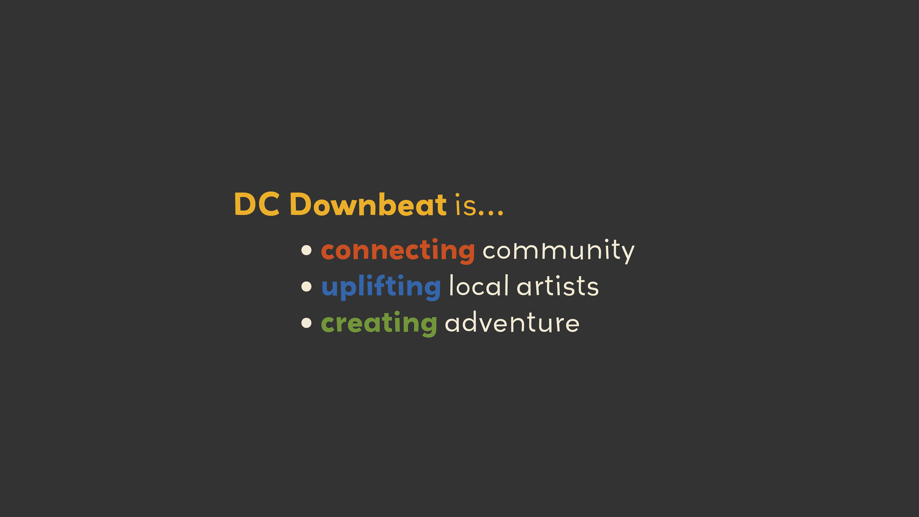
The goal of DC Downbeat is to offer a medium for community engagement, and act as a local initiative to uplift musical artists and the venues that support their talent. It is an after-dark experience for tourists and locals alike, encouraging exploration of a unique, shifting landscape.
defining the visual language
To develop the identity of DC Downbeat, I began by exploring logos inspired by abstract and art deco styles, referencing antique jazz posters for inspiration.

Original logo concepts played with blocky, abstract shapes, and different ways of mimicking movement and rhythm through type - jagged or mismatched letters, and overlapping shapes.
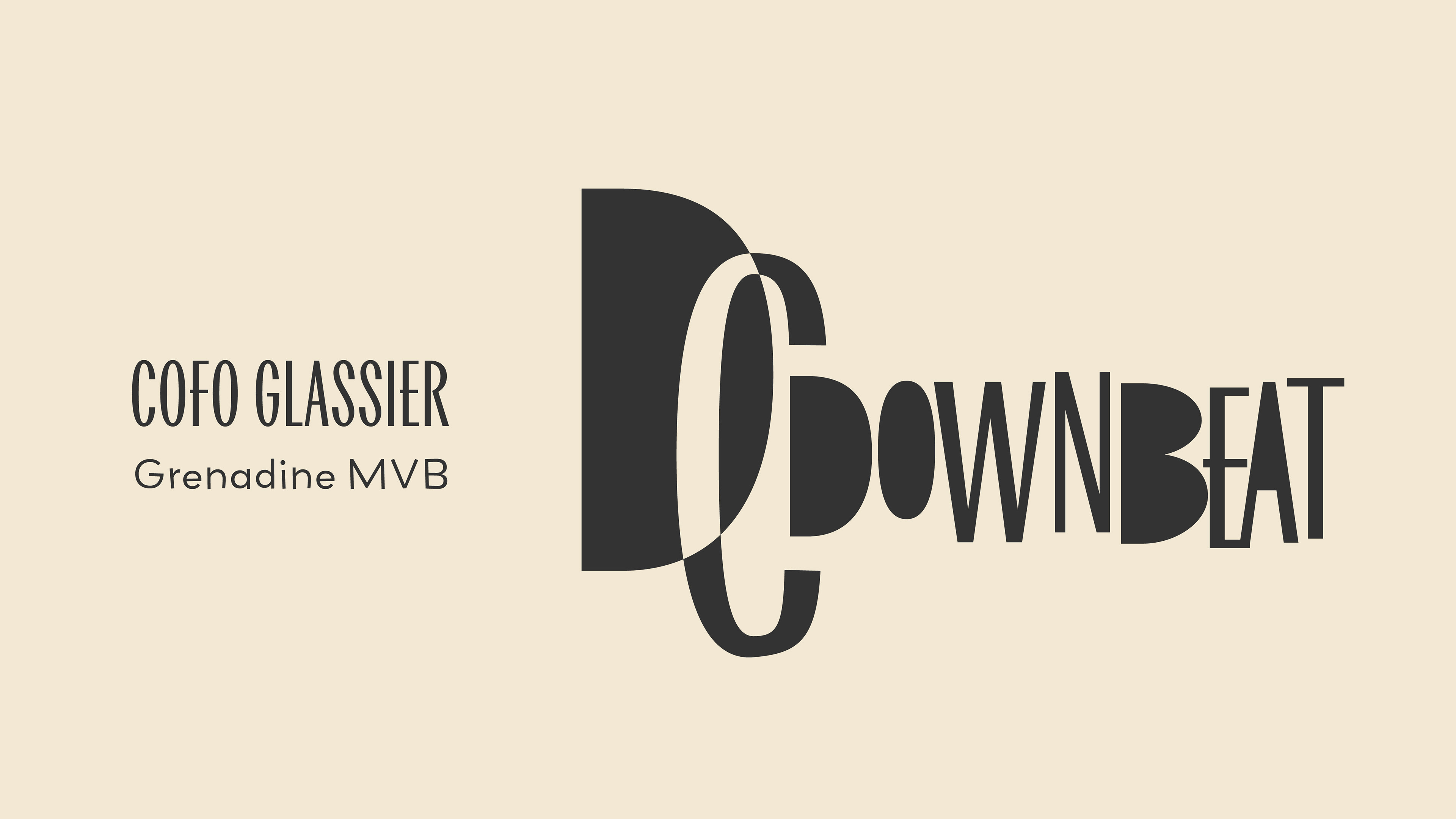
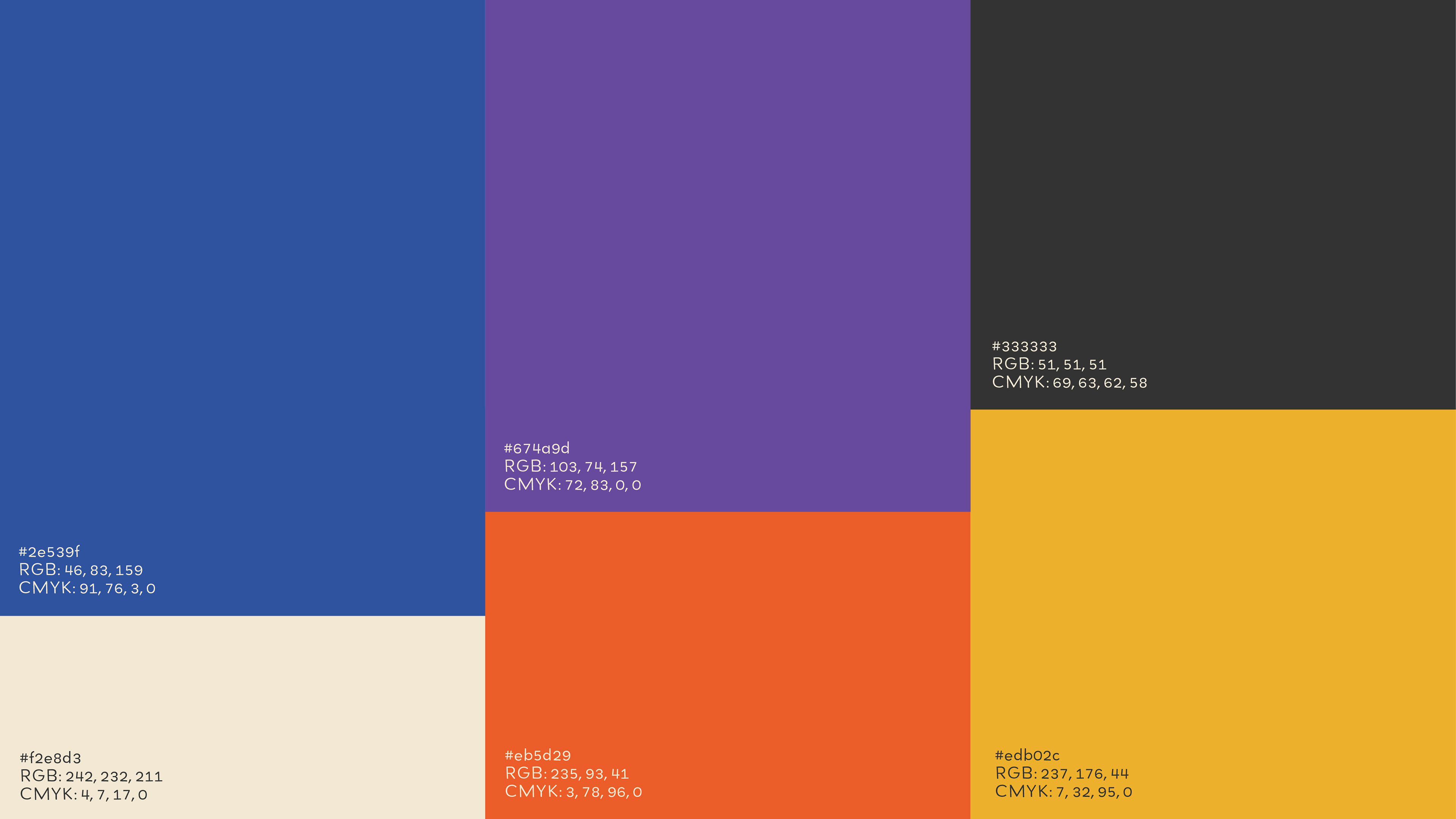
This is the finalized logo concept for Dc Downbeat, with added overlapping to allude to coinciding harmonies. The color palette has been defined to emulate a "night time warmth" - a nod to the glow of streetlights and dim bar settings.
The next step in shaping the visual language of DC Downbeat was exploring instruments in abstract forms in the campaign's poster. This included the shape exploration of different instruments, including the trumpet, bass, and piano. Once I found the direction that best captured the essence of the campaign, I refined it to best showcase a whimsical, vibrant atmosphere.
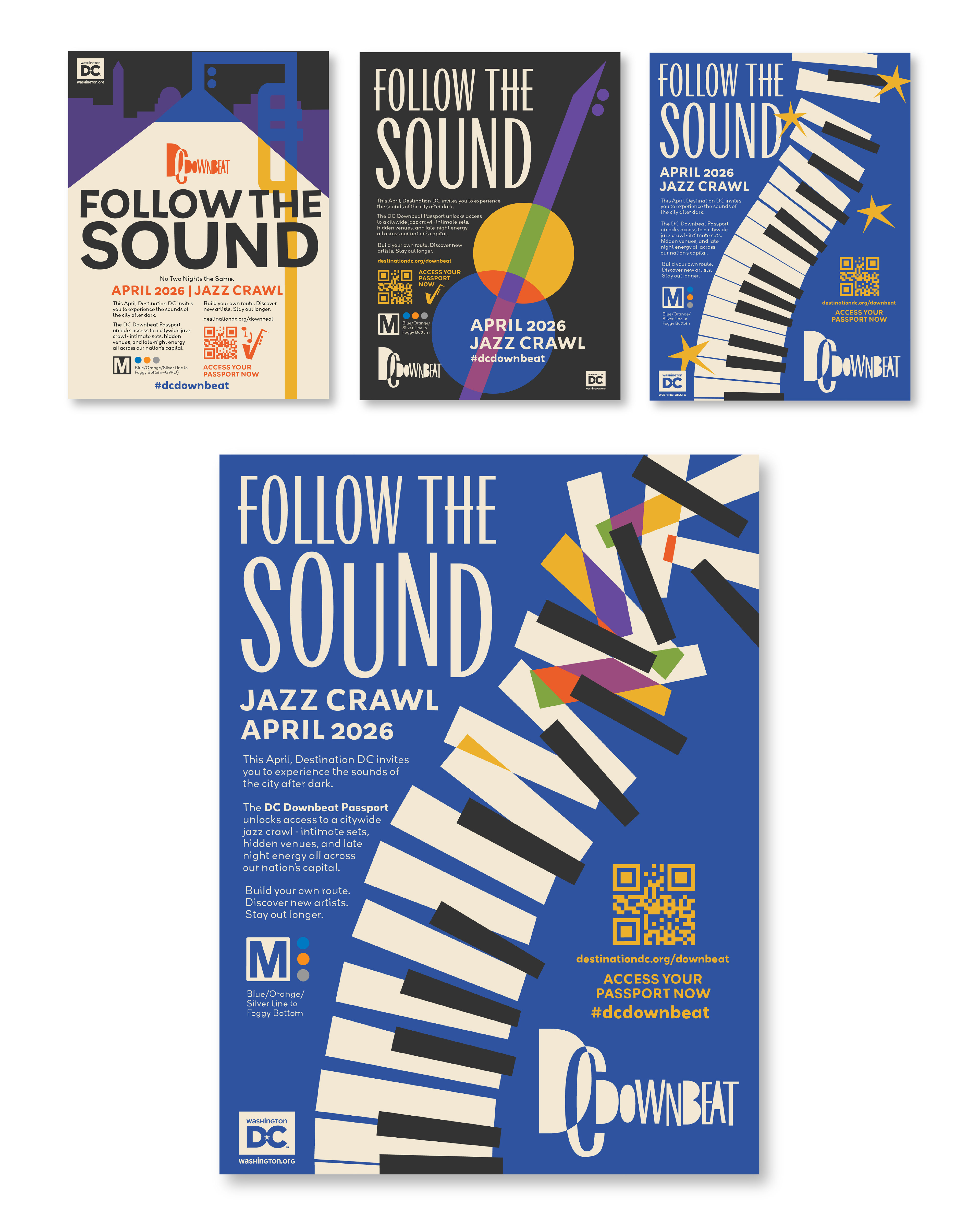
the campaign in action
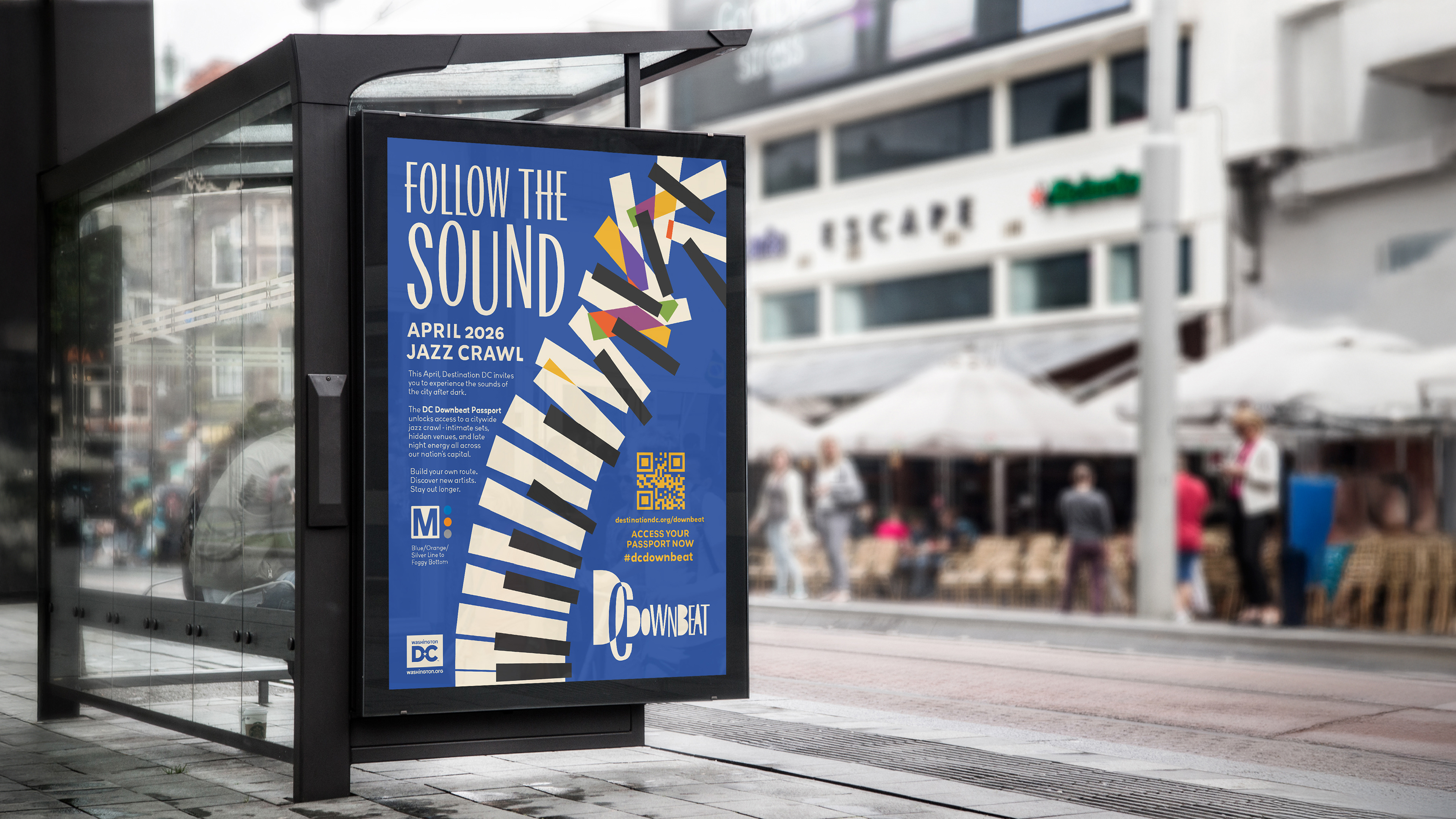
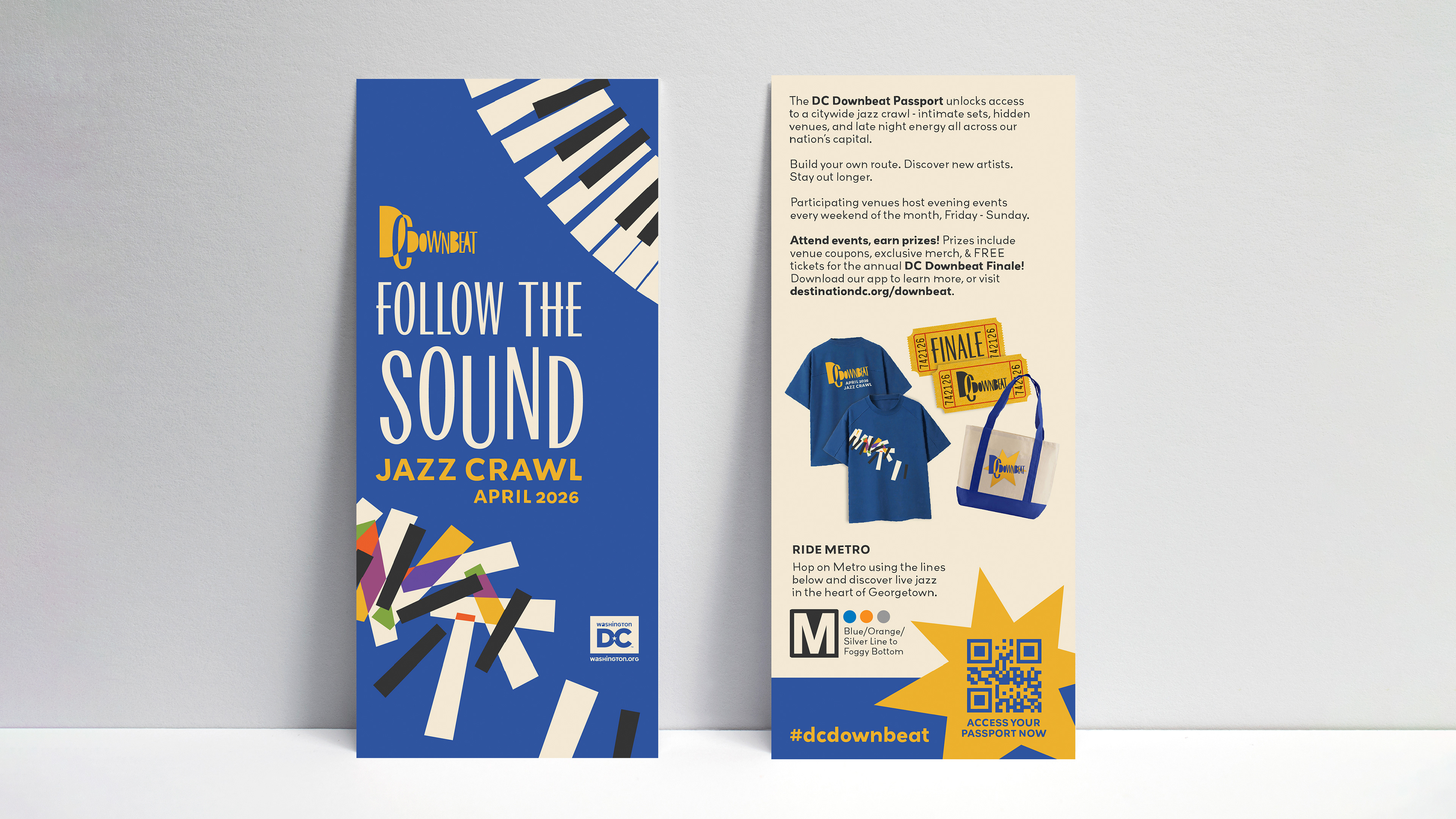
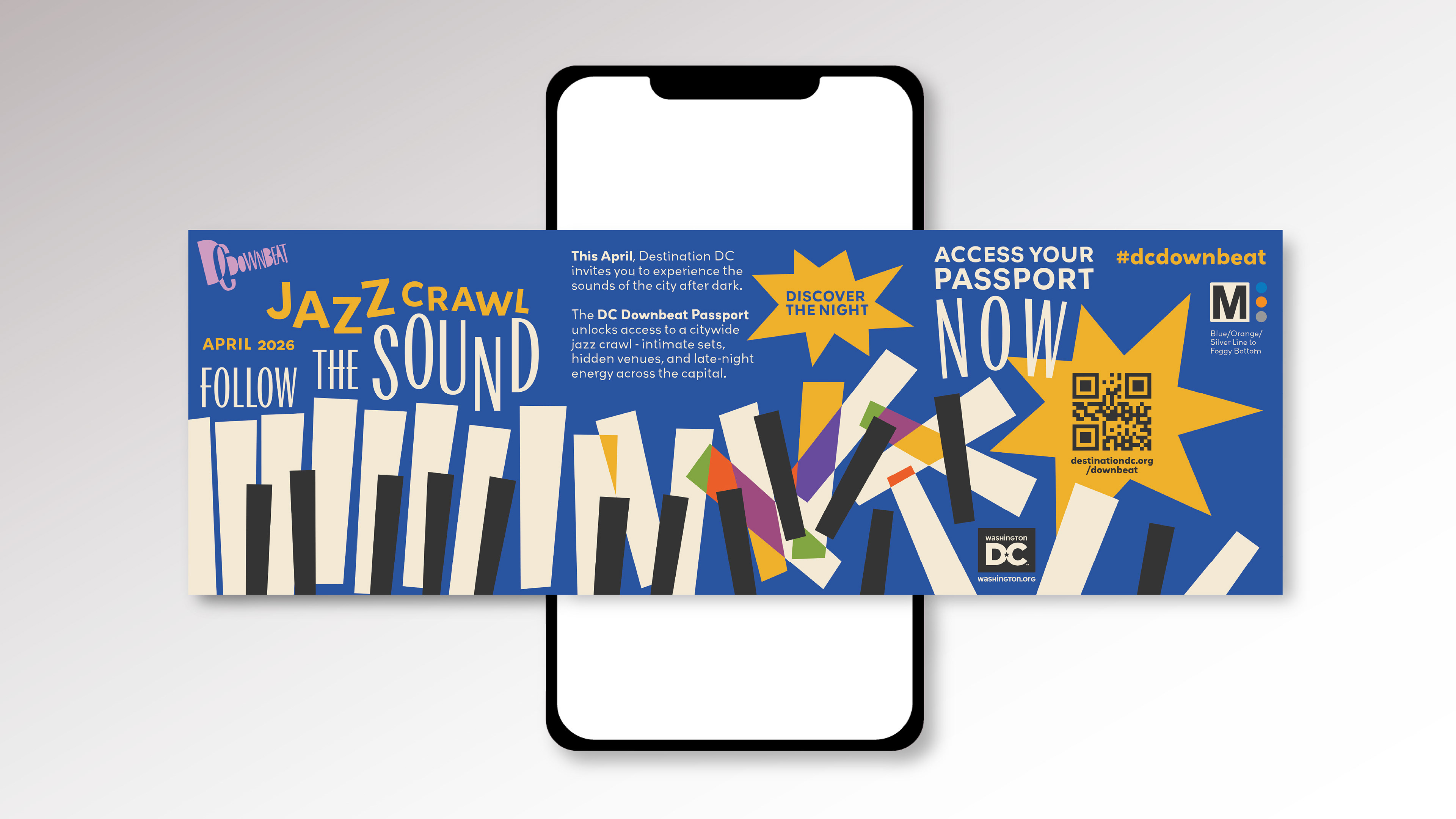
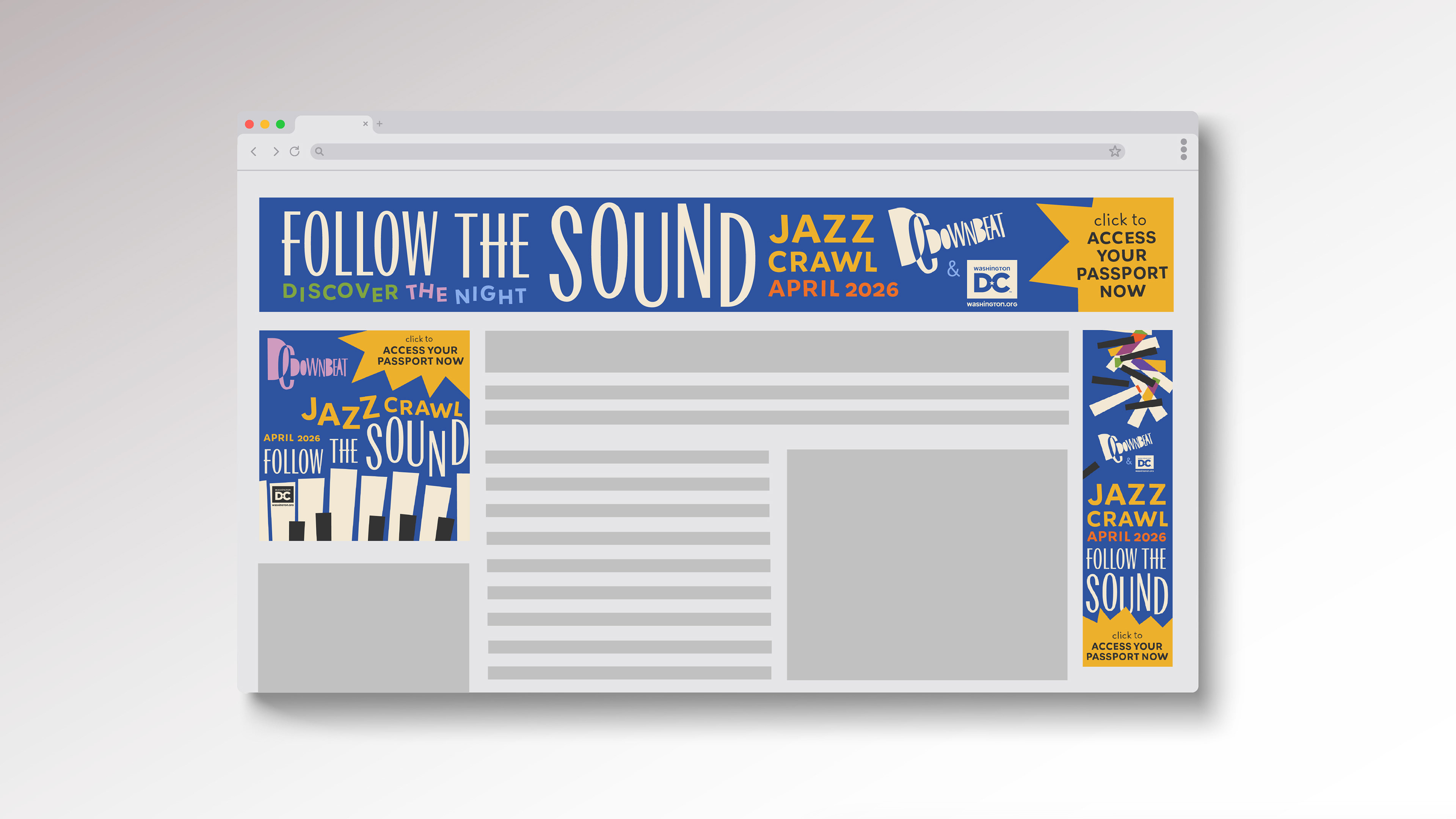
This is how DC Downbeat is imagined in the real world, through a variety of touchpoints, including physical and digital formats. The touchpoints prioritize a connection to public transport systems and urban environments.



dc downbeat in motion
This animated reel imagines how DC Downbeat would reach a digital audience through short-form content, maintaining the vibrant, spunky feel of the brand in the way it utilizes motion.
how does DC Downbeat's visual strategy translate year to year?
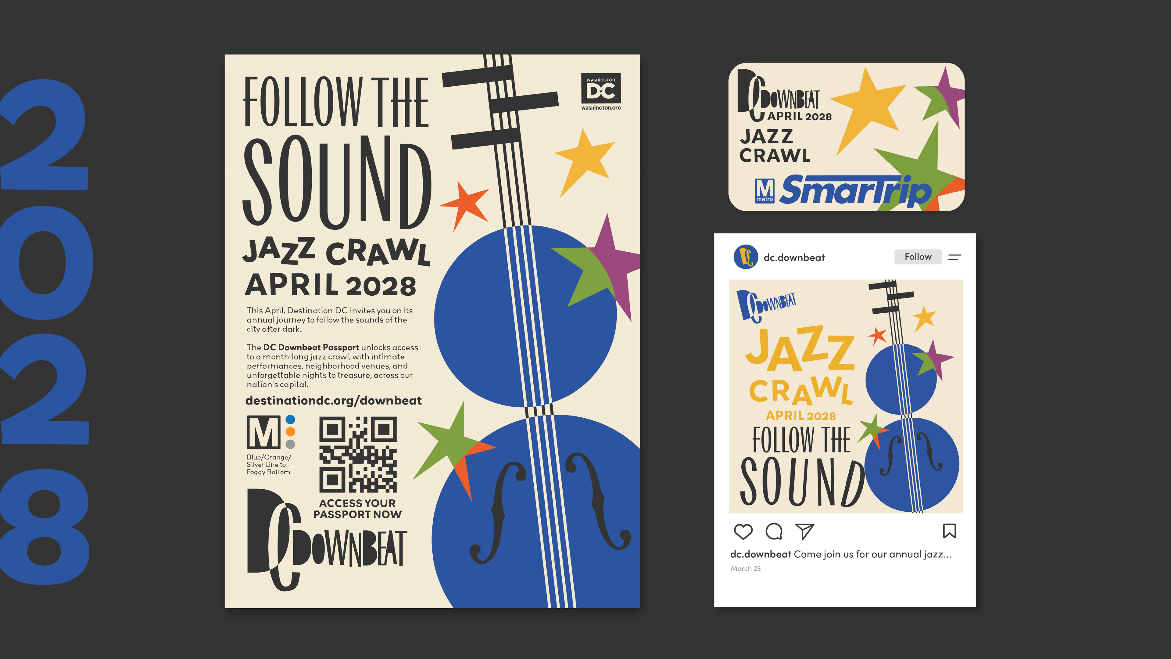
To expand on this project, I wanted to consider how DC Downbeat's Follow The Sound event and its visual language would translate to future campaigns for the same event.
For these future concepts, I knew what needed to be prioritized most across all campaigns were campaign recognition among the audience, visual novelty to generate excitement, and a consistent brand voice in both language and visuals. To achieve this, I decided to change the hero imagery of each campaign - a different iconic jazz instrument for every year.
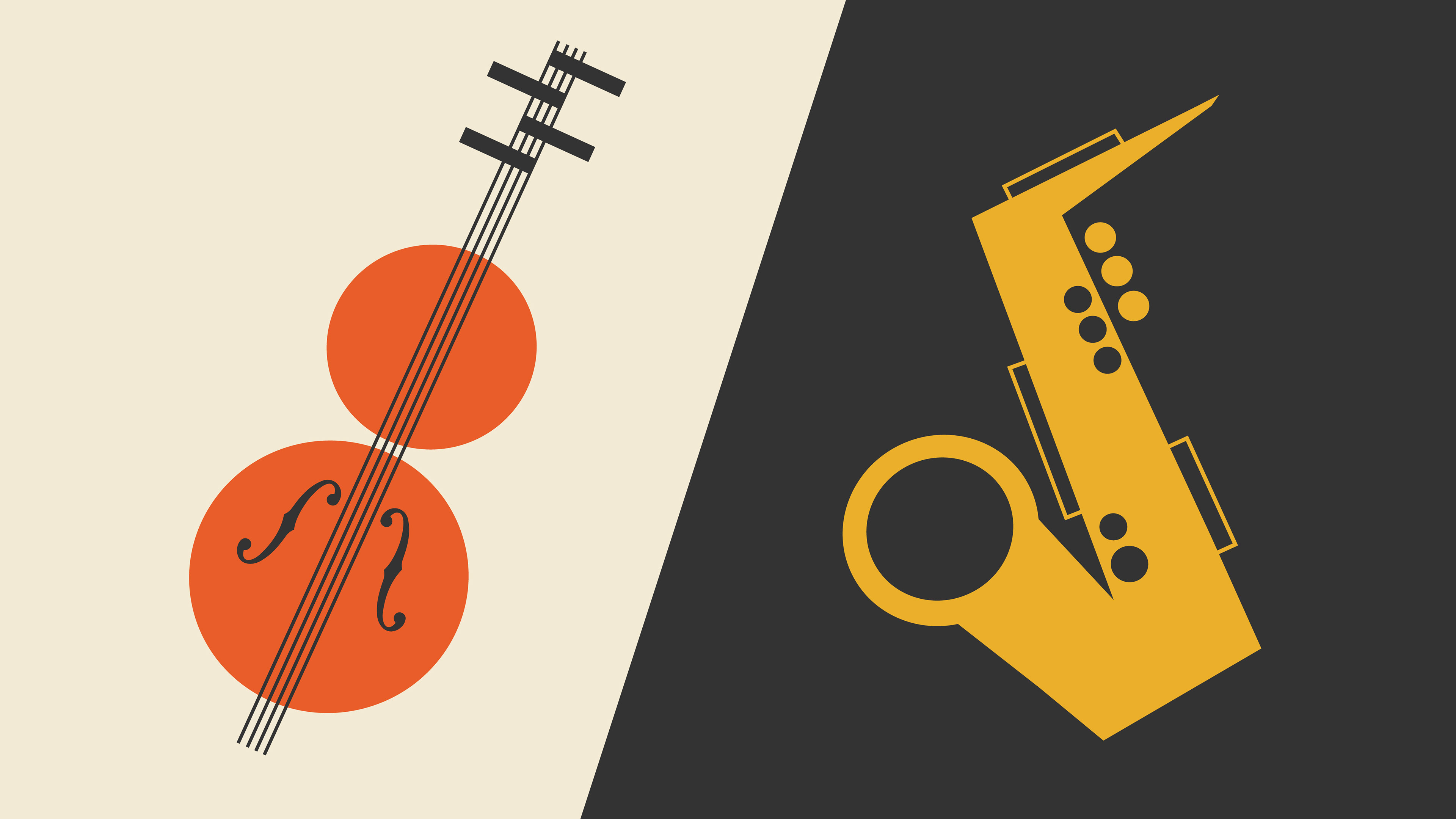
Once I finalized the form of each instrument, I experimented with color hierarchy. In order to optimize recognizability for the campaign, year to year, I decided to maintain a more consistent color hierarchy throughout. The dominant colors are blue, white, and black, with the others in the palette acting as accents. With this design method, a passerby at the metro station, or someone casually scrolling through social media will not only have their attention grabbed with the unique and exciting visuals, but also maintain a familiarity with the brand and this specific recurring event.

campaign cohesion
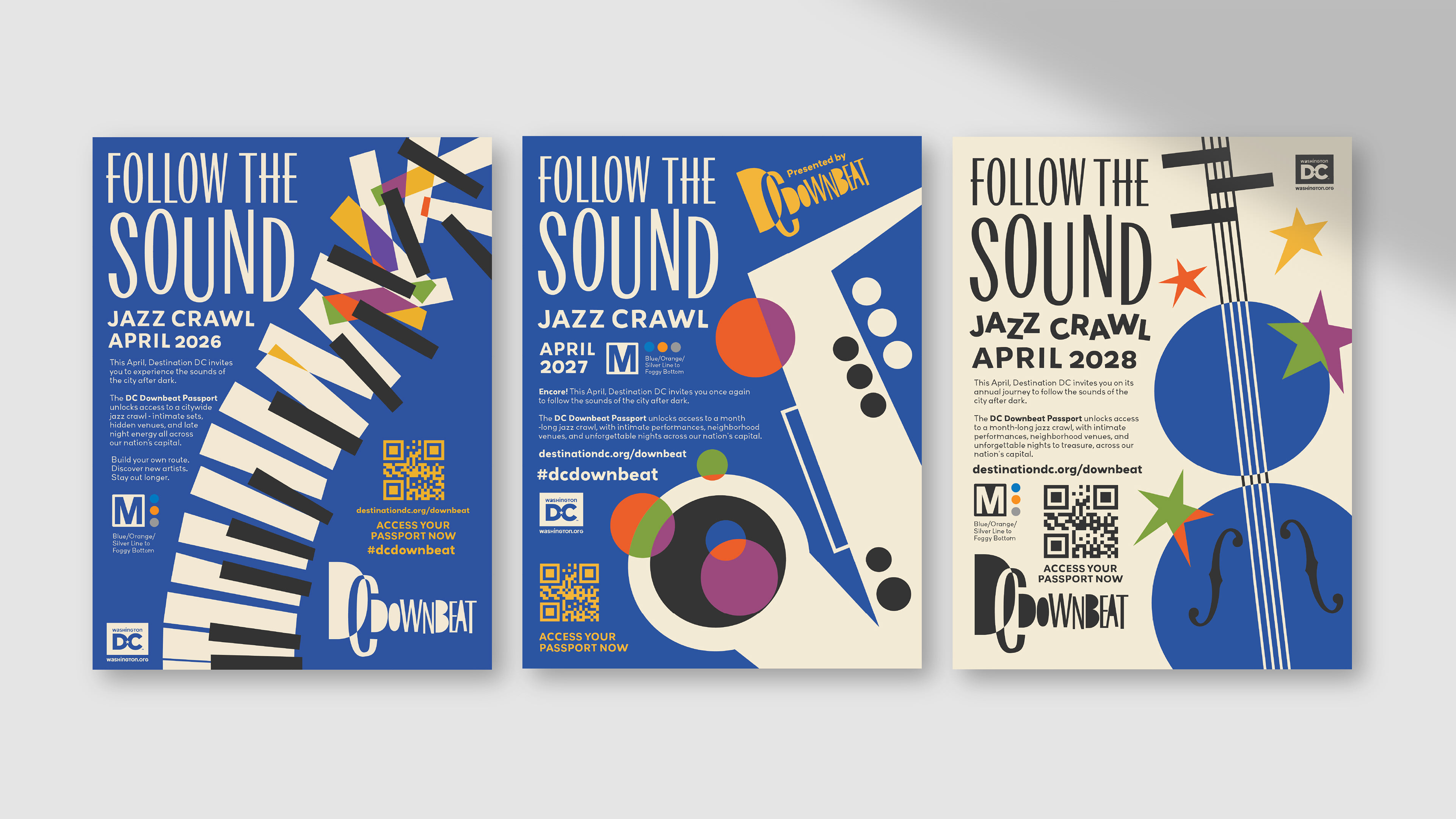
The result of this concept extension is a demonstration of how a current campaign lives beyond its lifespan. It becomes integrated as a unique, cultural experience that offers both new, engaging visuals with each passing year, and a distinct familiarity that grows a sense of comfort and predictability.
Credits
Design - Fiona Dale
Animation - Fiona Dale


